
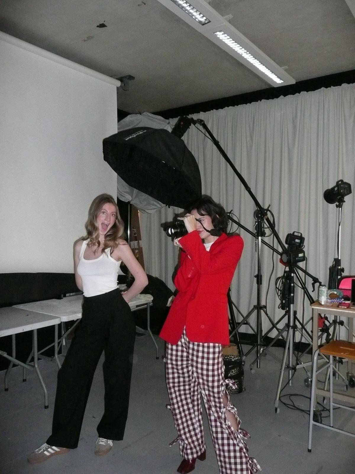
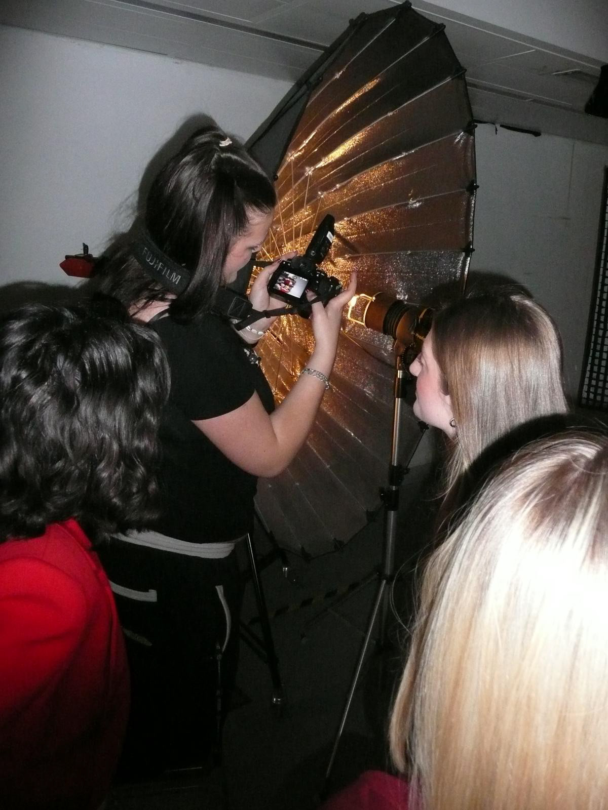
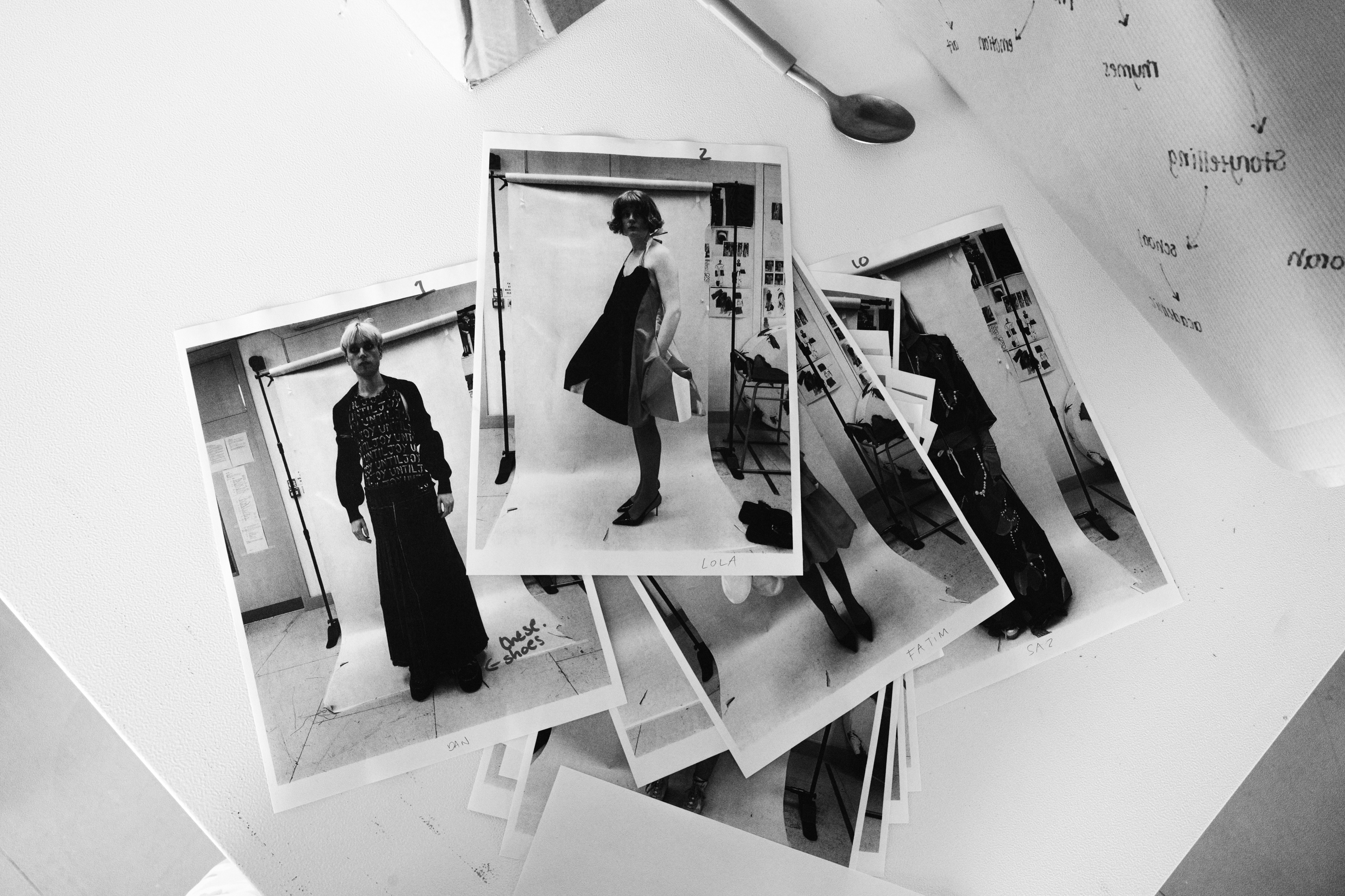
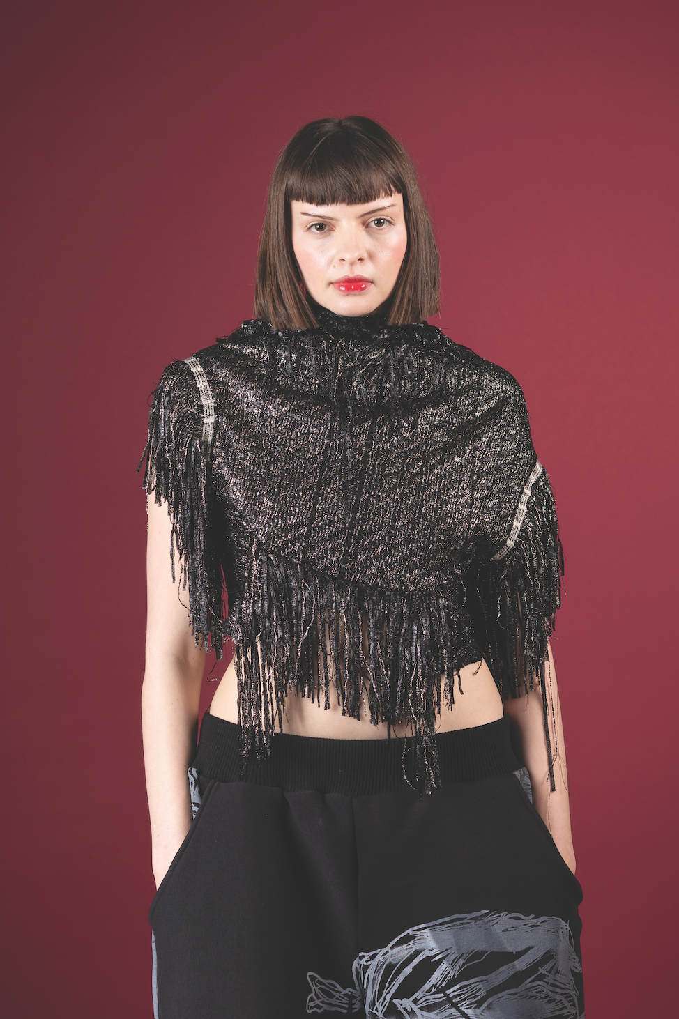
Utilising the in-house studio, it was essential that we include the timeless elegance of fashion editorial tradition. Allowing for just the right amount of polish, accompanying these images was a scrapbook style. For both the demographic and originality, we incorporated mixed-media techniques to generate the subtle sentimentality of crafting a collage.
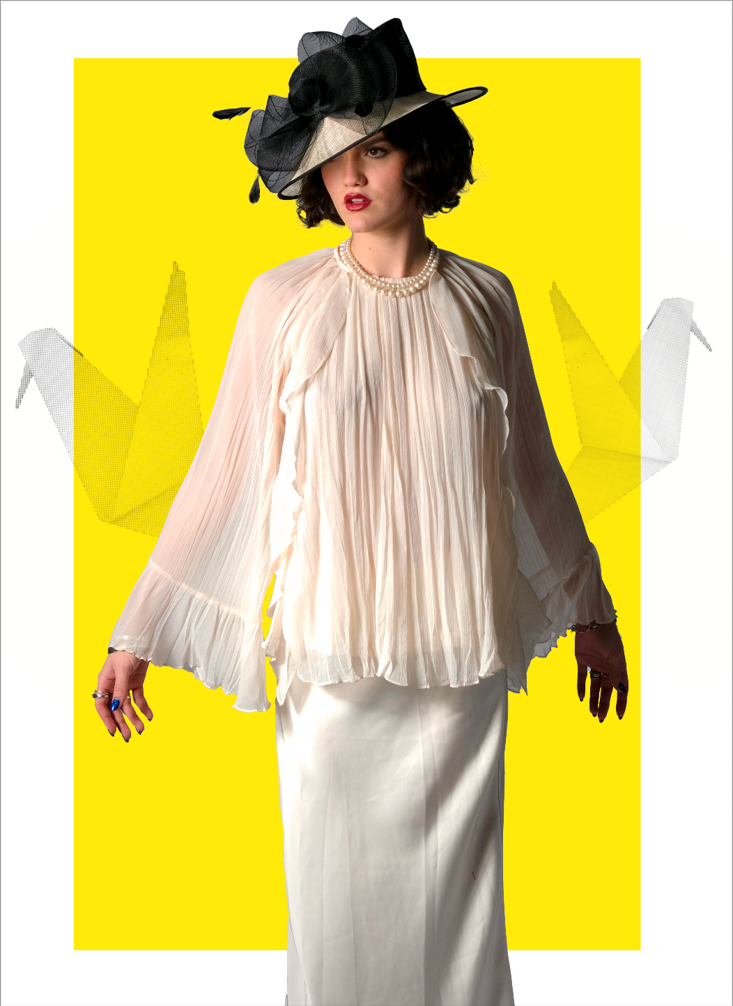

Vivid pops of pink, yellow or blue enhanced the refined colour palette we curated, allowing for richer compositions and eye-catching spreads.


One of our visual motivations was to give the reader the tools for an insight into the fashion industry. Creating traceable hints of the thought process for editorial creation and the self-expression it consequently promotes.


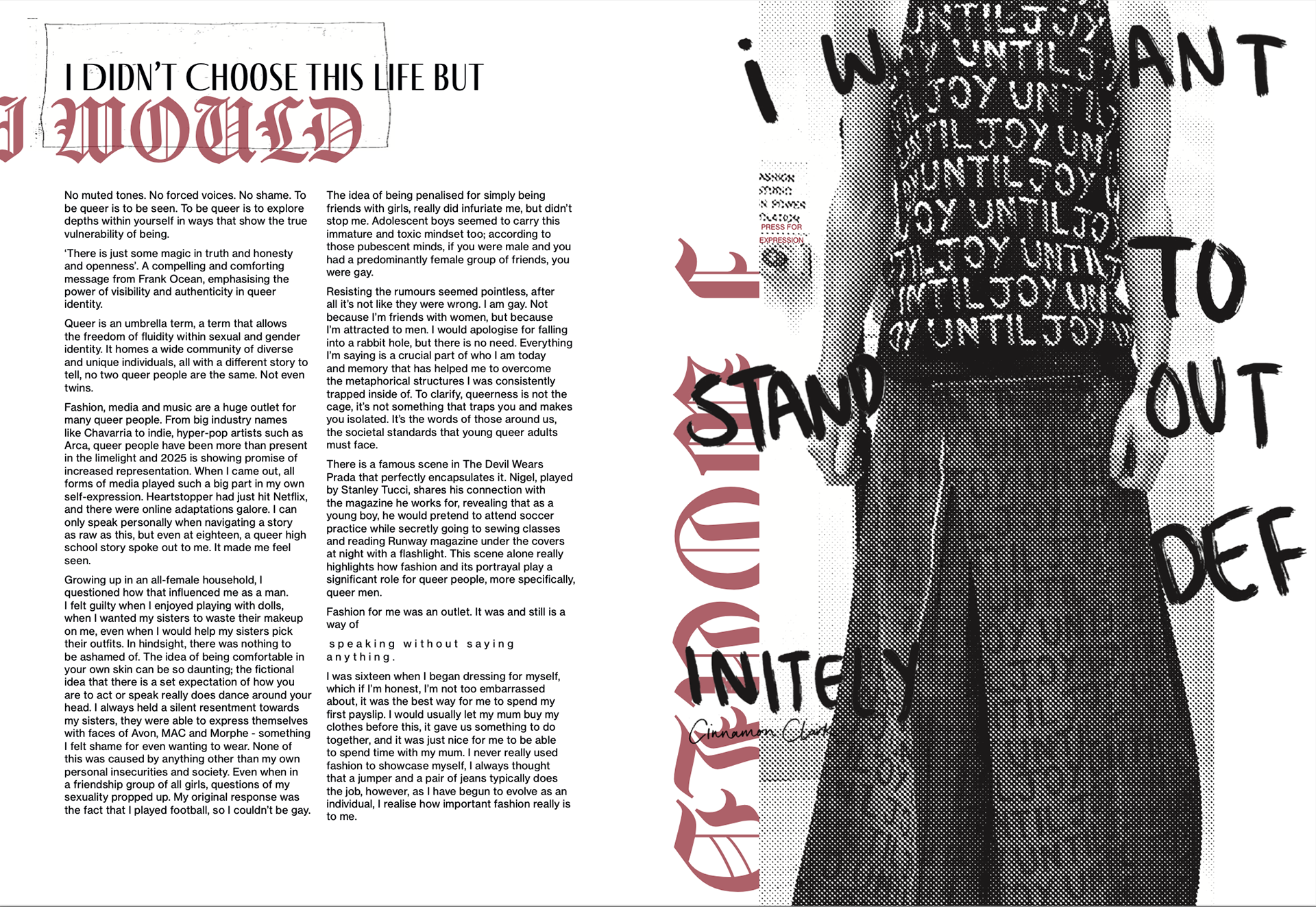
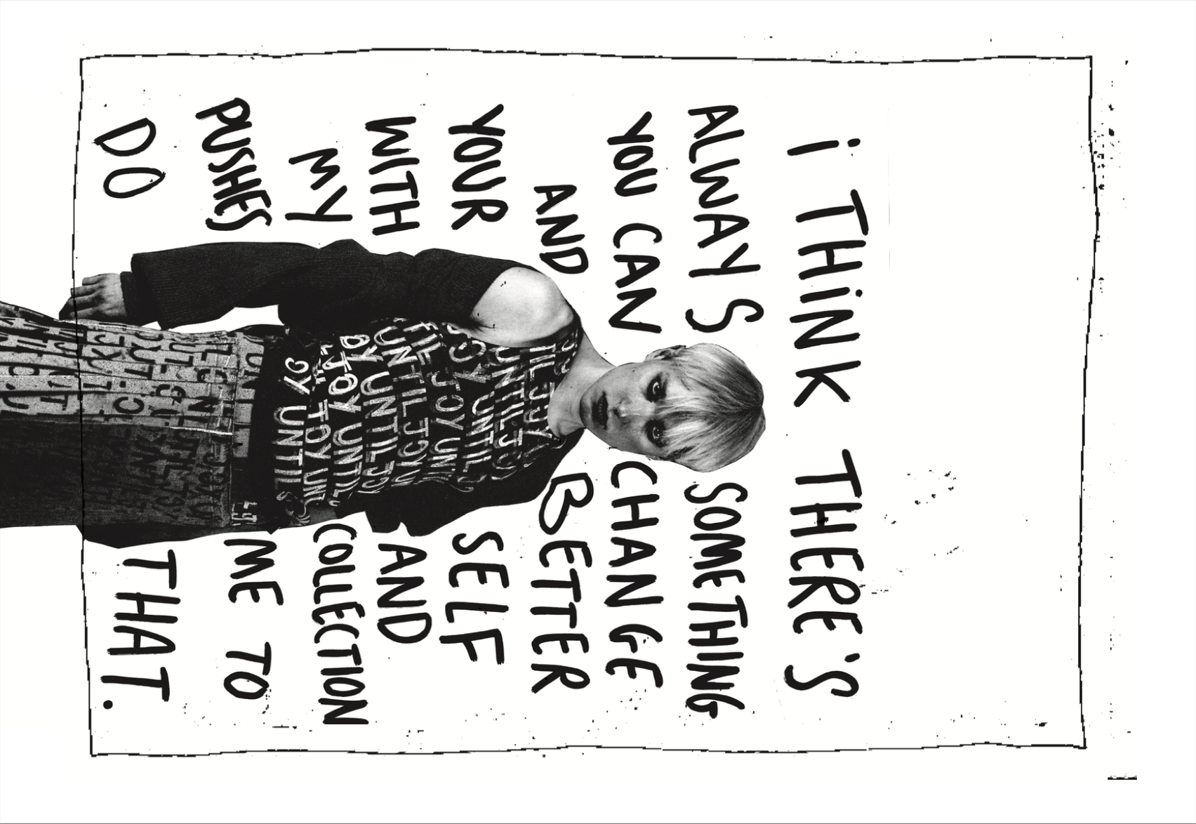
Bold fonts were the focal point of many page designs, centralising the nuanced messages of the magazine.

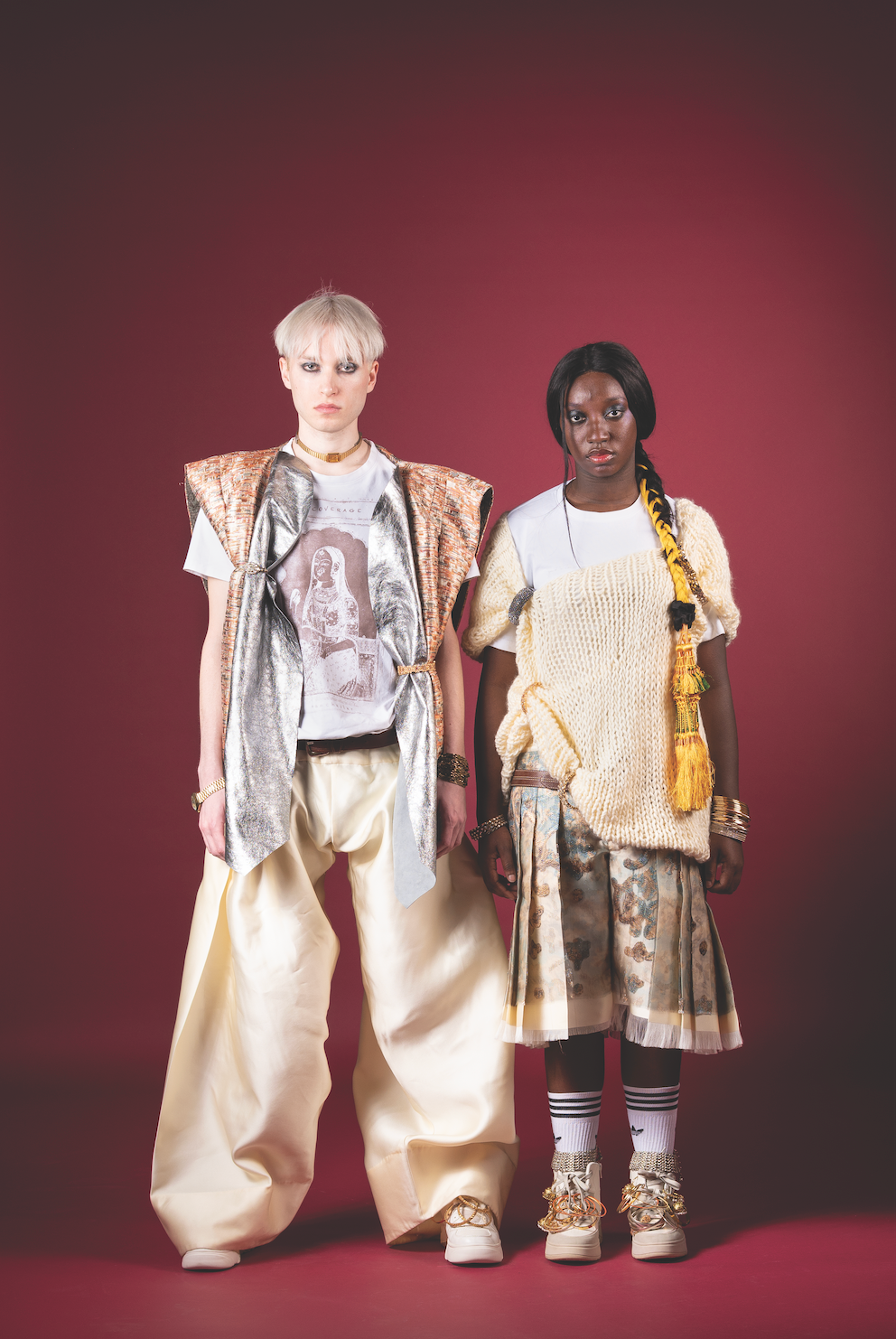
The work of the BA Fashion Design students enriched the publication with a variety of styles that resonated with the multi-cultural presence of Leeds and a spectrum of creative motivations. It added a refreshing, visual intrigue, to accompany the purposefully relatable styling of the other looks, throughout the magazine.
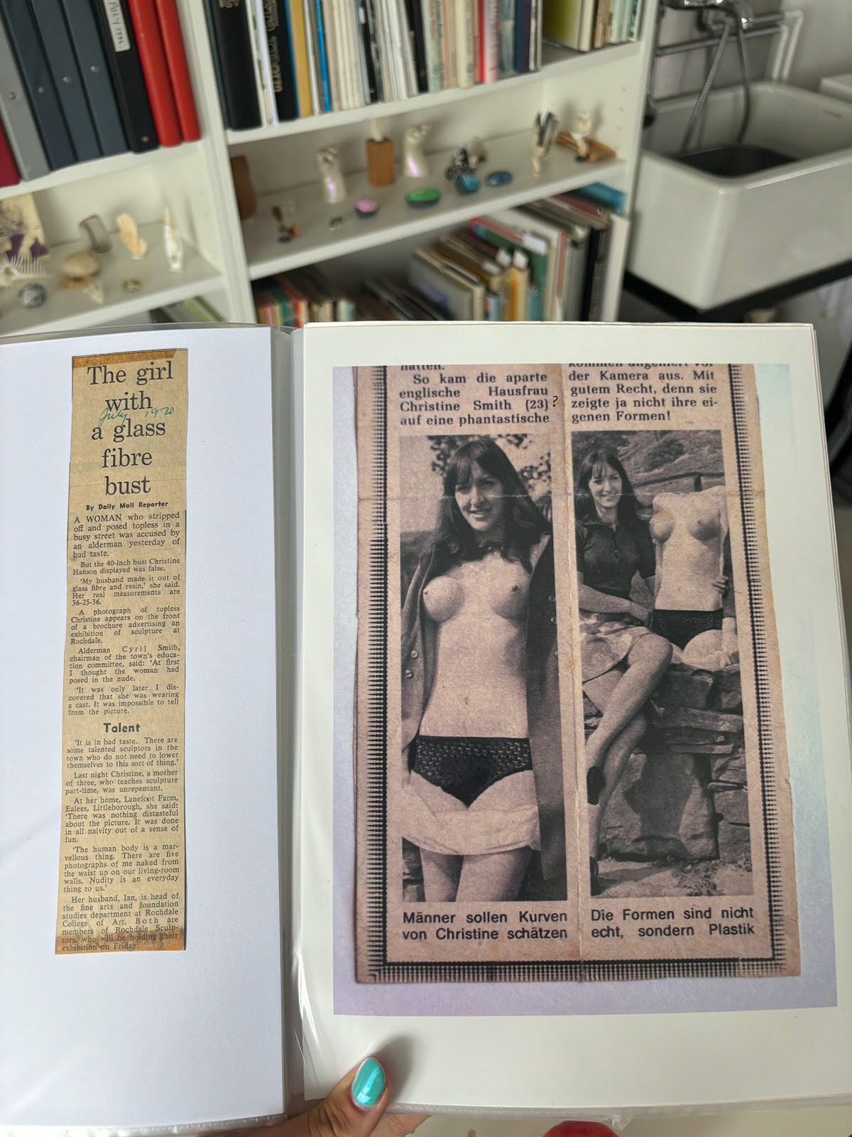
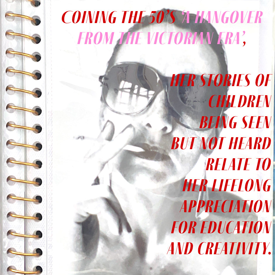
Nostalgia developed as a theme of several articles and worked perfectly texturally with the inspiration for the presentation of our spreads.
